Thursday, October 18, 2012

Production Log


This first piece is an attempt at photo-realism. I created the base for the donuts using a torus. Then, I ran a fluid simulation to make the chocolate topping fall onto the donut in a realistic way. The sprinkles started out as a particle system added to the chocolate topping. The particles appeared in random places on the top of the donut, and then I replaced each particle with a sprinkle. The floor is a seamless image of a wood floor with some geometric displacement for the reflections to seem more realistic. Finally, I duplicated the donut twice, colored one pink, and started with the compositing.

The compositing phase of the project was quite simple. I added a focal point on the closest donut by adding a blur on the objects that are further away from the camera. I also blurred the floor closer to the camera to create a nicer depth of field. After that, I did a small amount of color correction, and finished with a somewhat realistic image.


This next piece is my most recent work. It was created as an attempt at photo-realism in nature. Most of my images are geometric, but I decided to change that with an attempt to recreate the Windows XP default background field.

I started with a plane with small hills added to it. I added a particle system with 8000 individual particles. Each particle had 100 child particles, which puts the amount of grass stands at 800,000. Each blade of grass was colored so that the color changes from dark green to yellow-green going up the strand. The background  is just a picture of sky, and the sun is just a circle with a glare added to it. 

Because of the color correction section of the course, I decided to use some of the techniques learned in class to make the image better. I added a Curves modifier to edit the RGB curve. I gave it an "S" shape, which actually made the image seem more realistic than before. After the ridiculous rendering time, the image was finally done.


This image is one of the drawings I did for the idea/environment/portrait project. This portrays the idea of complexity and chaos. I started with a sphere as the base of the model. I selected random faces on the square, then extruded those into a maze-like shape. The inner sphere is essentially a light that doesn't emit onto the maze shape.

After the modelling was over, I added a glare to the inner light, and gave the center of the image a foggy glow to make the center of the sphere similar to a black hole. I altered the curves on this image as well to add contrast.


This skull is based loosely on the cover art for the Boyz Noize album "Oioioi" seen here. I created the basic model of a human skull, then replaced it with tiny cubes. Then, I gave the skull and the ground a reflective material.


This next piece is almost a test to see how light reflects and refracts within a transparent material. I created the model using simple techniques, then duplicated it. One copy is bigger than the other. The inner shape is completely black, while the outer shape is made of glass. 

The edges of the shape interact with the frame in strange ways. The center of the shape has two edges facing towards the top two corners, and the bottom edge cuts the frame in half. This causes the eye to flow through the image naturally.


This final image had many inspirations to it. I wanted to create a circular shape. I started with a sphere in the center, and a torus knot on the outside. The torus know was then put through a physics simulation to make it interact with the sphere and itself and give it that nice shape.

The lighting was something that was inspired by Martin Schoeller's pictures of celebrities. He has one bright fluorescent light behind the camera. This is what I recreated in 3-D. I also went into Photoshop to enhance the contrast using the curves editor. This exaggerated the effect, and made the shape cooler to look at.


Midterm Proposal

I plan on creating a portfolio of my most recent work in 3-D imaging. The portfolio will consist of work created from mid-August to the beginning of October. The later works will demonstrate techniques learned in class such as color correction and positioning within the frame.


2 Corrections and a Mask


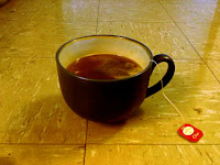
This first image started as a bland picture of a cup of tea. The colors do not pop like they should. I decided to fix this problem. I enhanced the overall contrast of the image to see the colors better (colorblindness), then I tweaked the individual colors. Red was added to make it warmer, blue was added to the floor's glare, and green was left the same.


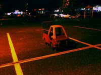
This image had a small amound of glare that washed out the image. To fix this, I increased the left side of the RGB curve, decreased the red slightly, and increased the dark blue.


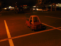
This final image started as a nice image, but the contrast of the character was very low. Using a mask to select only the character and the rainbow, I aded a filter to make the character stand out more. Sure, it looks less realistic, but it is much more interesting than before.

Wednesday, October 17, 2012

Color Corrections


The image on the left was taken in a dark restaurant. I was the only person illuminated by a over-table light. I took this image into Photoshop, and gave the background a little more light. In order to achieve this effect, I opened the RGB curves window, and added more brightness to the left side of the curve. Then, I evened outthe lighting on my face by making the curve horizontal on the right side.

This image was difficult because the colors were very off. Since I am colorblind, this color correction is possibly the worst. I added blue to the image because it was lacking it, and then I enhanced the contrast of the image. It looks better than the original, but still not that good. I gave it the good old American try.


This image was originally very warm and detail was somewhat missing in the colors. To fix this, I added contrast using the RGB curve. Then, I edited the red curve until I took out the right amount in the right places. Then, I added a good amount onto the blue curve to make the scene look cooler. The contrast added detail in the small parts of the image that mattered. The images on the left dragon pop more, and the reflection on the top looks crisper.


3 Compositions


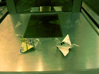
The composition above started out as a picture of origami on top of a cash register at Stop and Shop. The first thing I did when importing it into Photoshop was fixing the rotation and scale of the image. I rotated it to make strong horizontal lines, and then scaled the image up to have the diagonals line up with the left dragon. The next thing I did was move the right dragon to line up with the other diagonal.

The quick changes that were made went a long way in the quality of the image. The photo was taken quickly, and with no thought so that my boss wouldn't see me goofing off. The power of Photoshop gave the image the deliberate photographic precision that was not available to me at the time.


This next composition started as a picture to show my friends at home the sink in my room. It was crooked and didnt have any redeeming photographic value. After opening this train wreck in Photoshop, I rotated the image to create grid-like lines out of the metal support pieces. Then, in order to make the image more symmetrical, I moved the red contact lens case from the left side to the right side, and then clone stamped the area it was in to make it less noticeable.

These changes would have been easy if I was putting thought into the image, but I took a quick picture with a camera phone. Photoshop was an unnecessary step, but it had to be done to make the image look nicer.


The final composition took a lot of work to get right. Obviously, the portal was not originally in the picture. The portal was imported from a game appropriately named Portal. I used the free transform tool to alter the perspective of the portal since it was facing straight originally. Now it goes with the angle of the wall. Then, in order to make it look like Claire is blocking some of the portal, I cut off her shoulder, and sewed it back on in a higher layer than the portal.

This picture was the only one that didn't have to be rotated or scaled in any way. I took my time getting the image to be rotated correctly, and i even placed my camera on a flat surface to make it more steady.


Thursday, September 13, 2012

12 Images

Environment:
This is a photo of the elevator in Wolfe.

This is the view outside of a room on Wolfe 6

This is Justin Chengs rather nice room.

This is a drawing of a tree during a sunset.

Idea:
This is a picture of my guitar. It represents the idea of creativity.

This is a carpet. t's lack of pattern represents chaos

This is my sound system. It represents the idea of bliss.

This is 3d art I made to represent amazement.

Portrait:
This is a pic of me in front of a mirror. I am turned around because most mirror pictures are taken the other way, and I like to be different.

I thoroughly enjoy food, so I decided to depict that in this self portrait.

This is a photo of me in front of a fan because I am always warm.

This is a cartoony 3d representation of me. Including the obvious physical similarities, this cat is crazy just like me.


This is a picture of the sound system in my room.


I took the individual parts, and placed them on individual layers. Then I added a filter to those layers to create the effect above. I also used the same effect on the image below.