The image on the left was taken in a dark restaurant. I was the only person illuminated by a over-table light. I took this image into Photoshop, and gave the background a little more light. In order to achieve this effect, I opened the RGB curves window, and added more brightness to the left side of the curve. Then, I evened outthe lighting on my face by making the curve horizontal on the right side.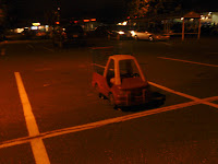
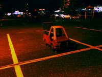


This image was difficult because the colors were very off. Since I am colorblind, this color correction is possibly the worst. I added blue to the image because it was lacking it, and then I enhanced the contrast of the image. It looks better than the original, but still not that good. I gave it the good old American try.
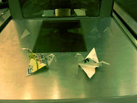
This image was originally very warm and detail was somewhat missing in the colors. To fix this, I added contrast using the RGB curve. Then, I edited the red curve until I took out the right amount in the right places. Then, I added a good amount onto the blue curve to make the scene look cooler. The contrast added detail in the small parts of the image that mattered. The images on the left dragon pop more, and the reflection on the top looks crisper.


No comments:
Post a Comment