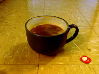
This first image started as a bland picture of a cup of tea. The colors do not pop like they should. I decided to fix this problem. I enhanced the overall contrast of the image to see the colors better (colorblindness), then I tweaked the individual colors. Red was added to make it warmer, blue was added to the floor's glare, and green was left the same.
This image had a small amound of glare that washed out the image. To fix this, I increased the left side of the RGB curve, decreased the red slightly, and increased the dark blue.
This final image started as a nice image, but the contrast of the character was very low. Using a mask to select only the character and the rainbow, I aded a filter to make the character stand out more. Sure, it looks less realistic, but it is much more interesting than before.


No comments:
Post a Comment